I once did quite a deep dive into the available covid data when the pandemic was at its height. The data was always changing then and as you can maybe guess, it’s changed a lot since then. I don’t care enough to try and make that post all work again, but in the interest of posterity I show some plots that came out of that. My main takeaway was that epidemiological models were absolute rubbish for predicting anything realtime, and the data/reporting was so inconsistent as to be almost meaningless as far as making specific claims. That said, it was a fun modeling and visualization exercise.
Note that I began the post early on and updated it sometime in the summer.
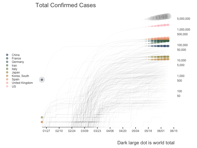
World


US State Level


Counties

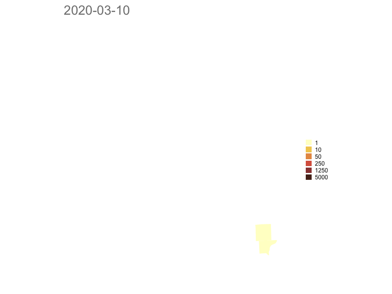
Michigan

Model based


Reuse
Citation
BibTeX citation:
@online{clark2020,
  author = {Clark, Michael},
  title = {Exploring the {Pandemic}},
  date = {2020-03-23},
  url = {https://m-clark.github.io/posts/2020-03-23-covid/},
  langid = {en}
}
For attribution, please cite this work as:
Clark, Michael. 2020. “Exploring the Pandemic.” March 23,
2020. https://m-clark.github.io/posts/2020-03-23-covid/.